
AI-Assisted Design


At a Glance
Role
Product Designer & Developer
Stack
Figma, Framer, Claude + MCP, TypeScript
Duration
6 weeks
Problem
Wanting my portfolio to show more depth and craft, and testing how AI could fit my process
Proof
AI-assisted build, 73 views on launch day
My portfolio wasn't showing what I was actually capable of. So I rebuilt it, completely, from the ground up. I had a genuine question I wanted to test too: how could AI actually fit into my own process as a designer, not just speed up small tasks.
Rather than start by designing pages, I treated the whole project as a product. I built the actual structure and system behind it before any screen existed. Six weeks later, working solo, that starting choice shaped everything that follows.
Before I designed a single page, I did real research, using Google's own AI-powered deep research tool to help. I looked at who actually reviews a portfolio, what strong designers were already doing, and where design hiring itself was heading with AI.

Even the research had a research plan first.
Key Insights
A recruiter looks at a portfolio for seconds. A hiring director might spend several minutes. Those aren't the same reader, so the site is built in layers: a fast summary up top, real depth underneath.
AI fluency isn't a nice-to-have in design hiring anymore. Most design leaders now treat it as essential, and the pay gap between designers who use it well and those who don't is real. This wasn't a trend to chase.
I also studied portfolios from designers I actually respect. The pattern was clear: confident typography, real restraint, no unnecessary decoration. It confirmed a direction I was already leaning toward.
None of this was guesswork. Every choice that followed had something underneath it.
AI can produce endless options, fast. What it can't do is know what it actually feels like to be the person on the other side of the work. It doesn't know what's actually good in a given context, or why one version of something matters more than another.
That's the thing no prompt can replace. So I stayed hands-on with every real call, not just reviewing what came back. That real, human connection to the person reading is what drove everything here.
AI optimizes for what's logically correct, not what actually reads well emotionally. It can organize a portfolio soundly without understanding that a reader needs to trust the person behind it before they're ready to be impressed by the work. That distinction isn't something AI has built in. I had to bring it.
AI treats thoroughness as a virtue on its own, including every relevant detail rather than cutting for what a reader will actually get through. But completeness and readability aren't the same goal, and only one matters to someone giving a page ten seconds. Knowing which to prioritize isn't something AI decides. I had to.
AI often assumes a reader already knows what it knows. Left unchecked, it writes as if the reader were part of the conversation that produced the content, skipping context a stranger would need. Catching that gap isn't something AI does on its own.
Design still needs a designer, especially when it's your own story someone's trying to connect with. My next real decisions were about keeping my judgment in control.
Keeping my judgment in control started with the very first real decision, before I designed anything at all.
That structure held for the rest of the project. It's why the rest of this actually worked.
Before any of this could work, Claude needed real access to my actual project: my rules, my research, my structure, not just whatever I typed into a chat box.
That access is where everything else here started: a real technical pipeline, then visible iteration across four pages, each rebuilt multiple times before anything was considered finished.
The Technical Build
I connected Claude directly to my own project files through a filesystem connection, scoped narrowly to just this project, so it could reference my real rules, research, and documentation directly.

Claude got a key to one room, not the whole house.
Wireframes themselves started as real, working HTML and CSS, not static images, a low-fidelity stage built for testing structure and behavior, not visuals. That choice was deliberate: code can be tested for actual behavior, tracked cleanly in version control, and matches how AI drafts and edits best.

This is what 'written reasoning' actually looked like, every round.
Getting that into the live site meant a real pipeline: Claude Code and Figma's own remote MCP server brought the coded wireframes into Figma as editable frames for mid-fidelity refinement, then a second tool brought that refined work into Framer itself, where I made real, hands-on adjustments before anything went live. Both tools were chosen because they ran on infrastructure I already had.
The Design Process
Every page went through many full rounds of real iteration, not quick touch-ups. The homepage alone went through 9. The case study template went through 7. Resume went through 3. How I Work went through 7, and one of those rounds wasn't a small revision, it was a real reset.
Every round, on every page, came with its own written reasoning. Each one documented what it tested, what worked, and why, so real decisions could get made quickly instead of every choice becoming a matter of opinion.


Low-fi to mid-fi to final, the same page, several real iterations apart.
Want a peek behind the scenes? Here's the GitHub repo. :)
The real test wasn't whether the site looked better. It was whether any of this actually worked, as a way of working, not just a way of looking.
The clearest proof isn't a number. It's what you're reading right now: a real, complete case study, built by the exact process it describes. That's not a claim about potential. It's the actual result of it.
Attention picked up too. Traffic has stayed meaningfully higher since the relaunch than it was before. Not the point, but I'm not complaining.
Both halves of the original question got answered. AI turned out to fit my process in a real, repeatable way, and the depth I set out to show is actually there for anyone who looks.
Before this, I'd incessantly tinker with my portfolio without ever finishing it. Every pass chased a different look, never anything with real substance behind it. It took an enormous amount of time, and I still didn't feel proud of what I had.
Having an actual system changed that. For the first time, I had a real way to build my work in depth and actually show off the things I'm genuinely proud of.
The system itself was entirely new for me. I'd vibe-coded before, but never worked AI into something this deep. I wasn't sure it would hold up, and it did. It was approachable, malleable, and, when used well, it doesn't take over the work, it clears space for the parts I'm best at.
Tools & Skills
Product Design
UX Research
Systems Thinking
Figma
Framer
Front-End Development
Prompt Engineering
AI-Assisted Design
Deeper Look
A closer look at the real system behind this project, for anyone who wants to see how it actually works.
This is one story. There are others worth reading.

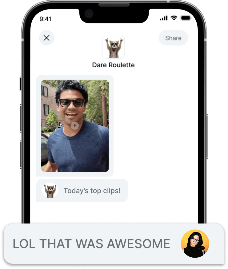



Designing for Connection
Industry Collaboration
Led interaction design for next-gen Ray-Ban Meta social features, turning 5,000+ research data points into a concept presented at Meta HQ.



Equity by Design
Independent research
Crafted a UX framework translating feminist theory into practice, validated with 10 UX practitioners and built out as a full interactive site.