


Feminist UX is a framework for designing more inclusively, built as a live microsite with three connected parts: understand it, feel it, then put it into practice.
At a Glance
Role
UX Researcher, Designer & Developer
Team
Independent thesis project — SCAD MFA
Duration
14+ months
Problem
No practical framework existed for inclusive UX design
Proof
10 UX practitioners tested it — confidence rose across every measure
In March 2025, I started an MFA thesis at SCAD around a problem I kept running into as a working UX designer: design that prioritized efficiency over the people it was supposed to serve.
Feminist theory offered a way to name that gap and push back on it. But when I looked for how to actually apply it, I found almost nothing. Feminist theory existed. Adjacent research existed. 'Feminist UX' itself, as a defined, usable framework, did not — and neither did any tools built to practice it.
Over the next 14+ months, working solo under my committee's guidance, I set out to define it and build something UX practitioners could actually use.
I started by searching for what already existed under the name 'Feminist UX.' The literature search turned up almost nothing — only nine results, across every academic database I checked.
Only two things came close, and neither was built to do what I actually needed.
Key Insights
User Inyerface teaches you that bad UX feels bad. It doesn't teach you who it feels worst for.

Built to frustrate you. It's very good at its job.
Feminist UX of AI proves feminist theory can shape real design thinking. It just proves it in one narrow room — AI concepts, speculative wireframes — with no door out into the rest of UX practice.

Genuinely thoughtful concepts. Still just concepts.
A similar conversation was already happening, one field over, in Feminist HCI. It just never left the academic room it started in.
This wasn't a knowledge gap. It was a translation gap. Everything needed to build Feminist UX already existed, scattered across different projects and fields. Nobody had translated it into something a working designer could actually pick up and use — so I did.
Knowing what needed to exist didn't make it easy to build. A few real limits shaped how the work actually came together.
There was no one to hand research off to, or split design work with. This entire project — the research, the framework, the toolkit, the site itself — was built by one person, working through every phase alone, one at a time.
Building a UX toolkit usually means adapting something that already exists. I didn't have that option — Feminist UX itself didn't exist yet, let alone a toolkit for it. Every question, every scoring rule, every piece of the toolkit's underlying logic had to be built from scratch, with nothing comparable to check it against.
Whatever I built needed to reach every designer, not just users of one platform — and needed to keep working even if that platform changed or disappeared. It had to work for anyone, on anything, indefinitely.
None of these limits changed what needed to exist by the end. They just shaped how I had to get there.

Every source got logged and rated before it shaped anything. This is where the decisions below actually started.
With the constraints in place, the actual design work started: turning a research gap into something with real shape. A handful of decisions ended up defining what that shape became.
None of these decisions happened in isolation. Each one built directly on what the last one revealed, and by the time they were all locked, the shape of the final artifact was already set. What was left was building it.
The final product is a live microsite with three connected parts: Learn, Experience, and Engage. Each one took its own real process to build, and each one solves a different piece of the same problem.
Every part started in Figma, as low and mid-fidelity mockups, refined through multiple rounds before any of it got built. The live site itself runs on Framer, but parts of it needed real development beyond Framer's built-in tools, including custom TypeScript components for things like the scoring logic and AI integration on the Engage page.


The same page, months apart. Placeholder boxes and lorem ipsum became real content, real imagery, and real interactivity.
Learn
Learn is the site's educational core. It had to carry the actual theoretical weight of the thesis without reading like one. The theory behind the five tenets spans multiple feminist and design frameworks. Turning all of that into something genuinely usable by a working designer, not just academically accurate, was the real task.
The page went through real content planning before a word was final: a full outline, sourced and revised, tracking every citation back to where it actually came from. I also brought in a subject matter expert in feminist theory to validate the content directly, not just my own research read on it. Real voices carry some of that weight too, including a line from bell hooks: 'The most radical tool we have is to imagine otherwise.'

The kind of quote that earns a standalone moment.
The theory also needed a practical hook for anyone reading with a business lens, not just a design one. Learn ties Feminist UX directly into the Nielsen Norman Group's UX Maturity Model, mapping the tenets onto Strategy, Culture, Process, and Outcomes, since that's language most UX teams already use.
Experience
Experience is a simulation. It puts you through two versions of the same everyday onboarding task, one built on anti-Feminist UX patterns and one built on Feminist UX principles, so the difference registers as a felt reaction, not just a read one.


The exact same step in the account setup, told two different ways. Read the copy on each side closely, the difference isn't subtle.
The flow moves through five stages: a landing screen, the anti-pattern onboarding, a midpoint reflection, the inclusive version of that same onboarding, and a closing screen. Same task, told two different ways. Building it as one continuous experience, rather than a series of static pages, meant the whole thing needed to be its own embedded code component.
Some of the anti-Feminist UX flow's most exaggerated moments, like sprawling terms and conditions with no real option to decline, or prompts that pushed you to rush through decisions, were built that way on purpose, not accidents. The goal was making the pattern impossible to miss, not subtle. Real testing reactions confirmed it landed: one participant said it felt like the flow 'wanted you to fail at every turn.'
Engage
Engage is the toolkit: a reflective tool designers can run their own work through, covering seven real phases of a design process, from early user flows and wireframes all the way to microcopy and finished UI components.
Underneath, it runs on an internal grading scheme. Each answer choice reflects adherence, or lack of it, to specific principles from the framework, combining into scores that shape the actual feedback the AI writes back, but none of that scoring ever reaches the person using it. What they see is written in plain language, describing patterns and next steps, never numbers.
That output went through real iteration, not one version. Early feedback categories were clinical: strengths, areas for reflection, general guidance. A co-creation session with practicing designers pushed back on that framing and on the format itself, wanting less of a text dump and something more actionable. The final version reorganizes around what's already working, where to go deeper, and concrete next steps, tied directly to the five tenets as the lens for every response.
The toolkit also produces something tangible: a downloadable set of cards summarizing the five tenets, meant to travel with a designer past the site itself, not stay locked inside it.
Download Toolkit Cards
Take a look at the live site before you go! :)
Everything built across the three pages needed to actually prove itself, not just exist. A final validation study with real UX practitioners tested whether it did.
Ten practitioners tested the finished site and rated their own confidence before and after, on three things: recognizing exclusion in design, considering diverse users, and applying inclusive methods to their own work. Every measure increased.
The strongest shift was in recognizing exclusion, jumping from 74% to 88% of maximum confidence, the clearest sign the simulation actually did its job. One participant put it simply: it 'made me think deeper than I think I would have normally.' Confidence in considering diverse users and in applying inclusive methods both grew too, landing at 92% and 84%, already strong starting points that still moved further.
74
%
Recognizing exclusion
0
%
Considering diverse users
0
%
Applying inclusive methods
The forward-looking numbers were even stronger. Practitioners rated their anticipated positive impact from applying these approaches at 96%, and their own readiness to actually integrate inclusive patterns going forward at 92%. People didn't just understand the framework. They said they'd use it.
0
%
Anticipated positive impact
0
%
Readiness to integrate
The implications reach past the study itself. Participants' own responses point toward something bigger: a shift away from purely neutral, efficiency-first defaults and toward genuinely intentional, inclusive decision-making, one that starts with individual designers having better tools, not waiting for it to be handed down from above.
Ten sessions can't prove behavior change on their own. But they show something real: people walked away more confident, more aware, and genuinely ready to bring these ideas into their own work.
This project changed what I think I'm capable of as a designer. I've worked on plenty of collaborative work before, but I'd never carried something completely on my own: the research, the framework, the interaction design, the front-end build, and the validation, all under one person's judgment, for over a year.
Iterating on my own ideas that many times, especially the parts that changed the most, sharpened something specific: knowing when to hold a decision and when to actually let it go and rebuild. That's a judgment call I use on every project now, not just this one.
I came out of it a more confident designer, and genuinely excited about what I can take on next. Not because the work got easier, but because I proved to myself I could carry something this big all the way through, on my own judgment, start to finish.

Still smiling by the end of it.
Tools & Skills
Product Design
UX Research
Interaction Design
Figma
Framer
Front-End Development
Usability Testing
AI Prompt Engineering
Feminist UX
Deeper Look
A closer look at the real technical work behind the site, for anyone who wants to see how it actually functions.
This is one story. There are others worth reading.




Designing for Connection
Industry Collaboration
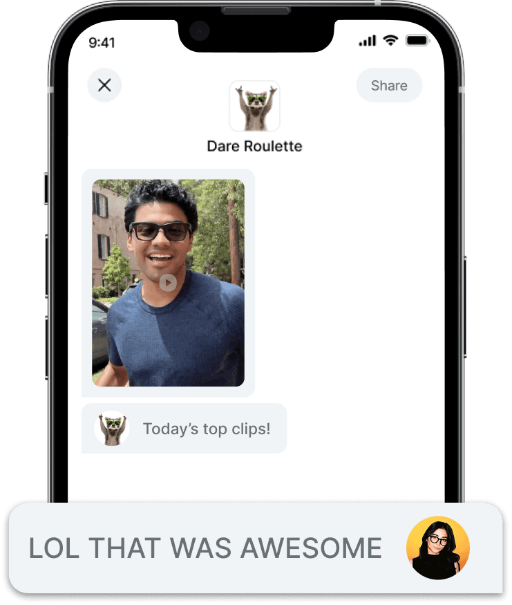
Led interaction design for next-gen Ray-Ban Meta social features, turning 5,000+ research data points into a concept presented at Meta HQ.













Behind the Portfolio
AI-Assissted Design
Rebuilt my own portfolio with AI as a real collaborator, turning 9+ wireframe rounds and thousands of logged decisions into a fully documented system.